Orange is never an easy color to pull off, but we love a challenge, and we couldn’t resist trying to incorporate Celosia Orange –one of Pantone’s 2014 colors for Spring – into some wedding day color palettes. Even if orange isn’t your favorite color, we think you’re going to love them!
Since orange can easily overwhelm the eye and take over a color scheme, the key to adding orange to your wedding day is to use it deliberately and sparingly. Pairing it with a dark, bold color like purple, adds a fresh, unexpected, and contrasting pop of color to the palette.
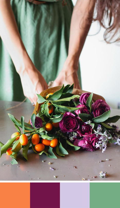
You might think that the clashing colors would make this color palette all wrong, but that’s exactly what makes it right. It takes serious guts and a great sense of style to make this work, but if you can pull it off, we think it’s worth it!
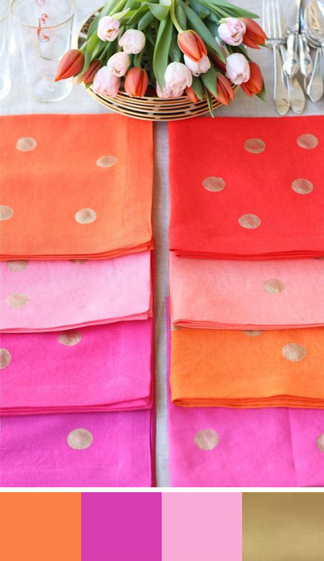
Like the palette above, pairing reds, yellows and oranges together might seem like a wacky idea, but we think it’s a bold and beautiful color combination. Add in a little ombré effect and you’ll be right on trend!
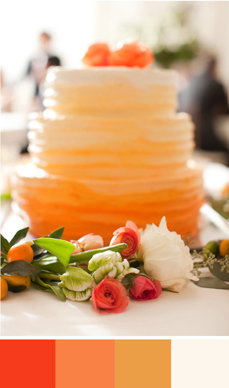
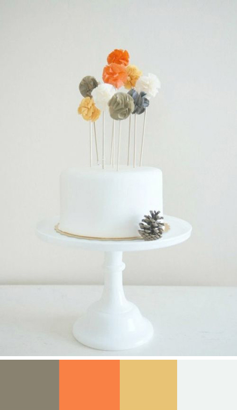
Lots of white helps to balance out this colour scheme and allows the orange to be a dramatic touch of color without overwhelming the more neutral colors.
Blue and orange are complementary colors, so pairing them together in your color scheme is an excellent choice. Here, navy blue adds a sophisticated and classic touch to the palette while the orange adds a little contemporary flair.
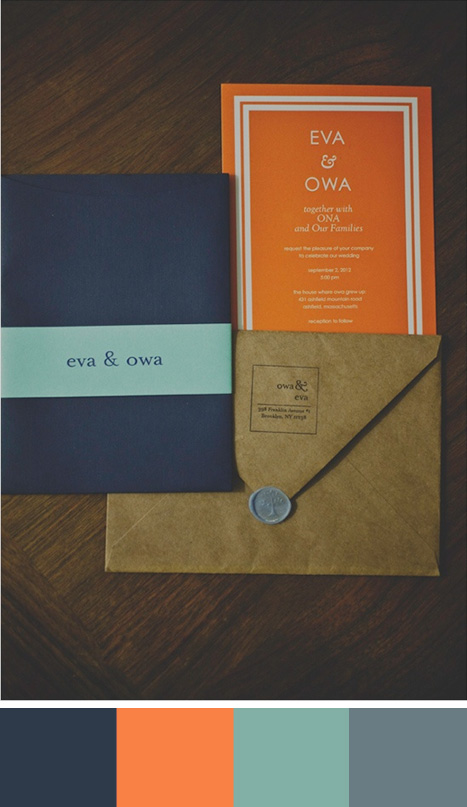
Photo one: yasminefloraldesign; Photo two: designmom.com; Photo three: 100layercake.com; Photo four: potterandbutler.com; Photo five: weddingchicks.com


